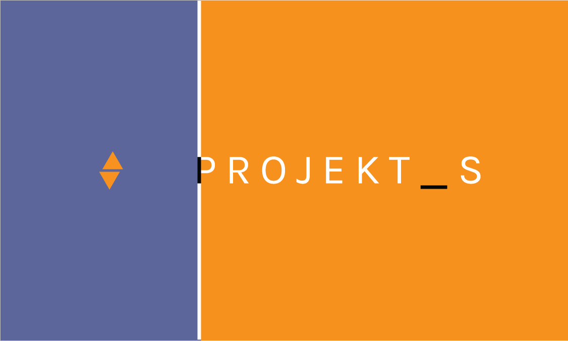
The first draft sports a gray blue on the left side as a way to avoid the "orange creamsicle" look. The choice of orange and white was deliberate, but the color scheme association was considered after the fact. Here you can see the inclusion of the P's black stripe into a dividing line. In the end, I felt the dividing line was too staunch of a separation between the two sides, but also felt like background noise to the actual design.
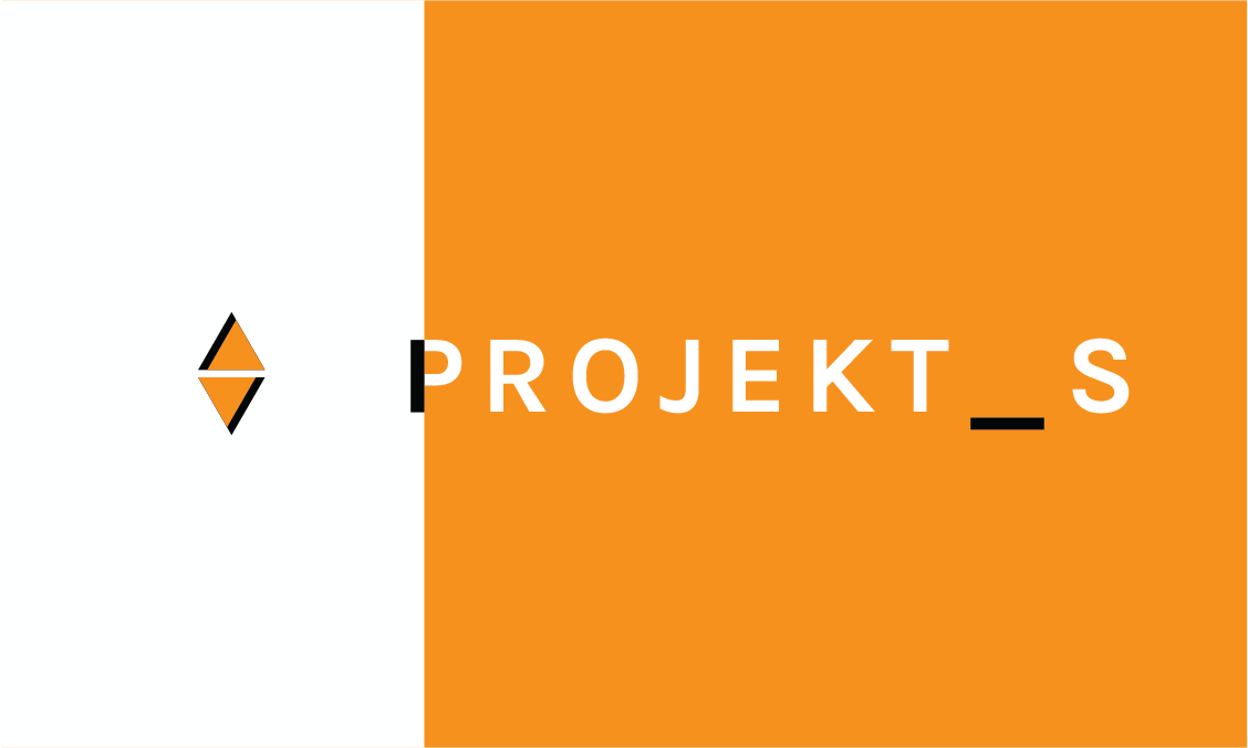
This second approach put far more emphasis on the logo design, creating what I believe is my favorite of the many logo ideas I went through. The text was bolded for more presence on the card, and the dividing line was removed. I resolved myself to use the creamsicle color scheme and planned to overcome the association through design, which never happened, contributing to my discontent with the final product.
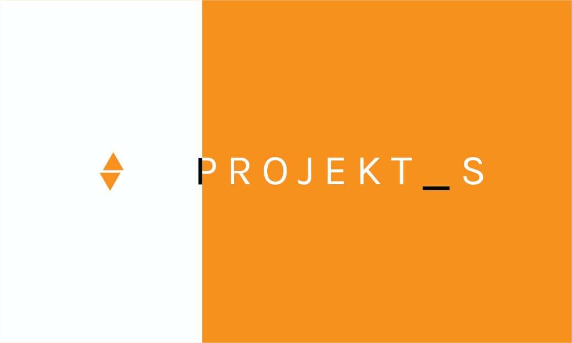
An attempt to return to a thinner font and re-simplify the logo. The issue quickly became the color imbalance and lack of impact that the text was having against the orange background. The logo lost a great deal of its form with the removal of its black embellishment, however to have it remain would have created an imbalance throughout the design.
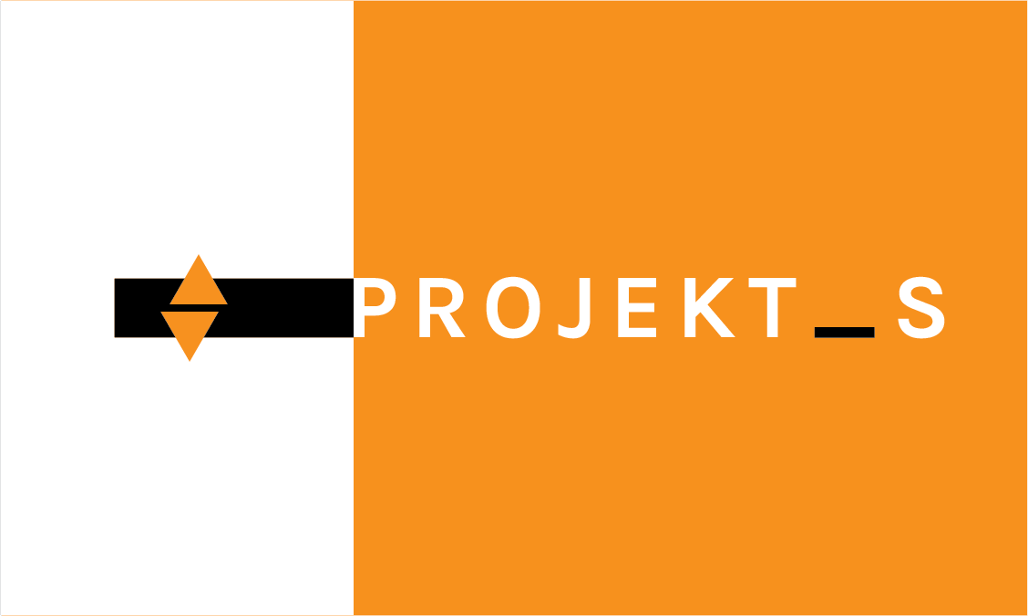
Returning to a bold font greatly improves the weight of the name, but the kerning detracts from this. The black bar was extruded behind the logo in order to provide it with some more weight of its own while still incorporating the contrast with the side of the P. I have begun to entirely reconsider orange as the main color, as I believe the actual design here is strong, but the white orange contrast completely overwhelms whatever minimal approach I was going for. The logo itself is also incredibly weak here. It feels as if its removal altogether would benefit the design. Although I am not a fan of the divide produced by the orange and white, the asymmetry of the black bar against the white letters is attractive to me.
This was the design I ended up using for my first draft print. Although the print was done on card stock with sub-par quality printers, the draft cards revealed a lot about what I did not like in my current design.
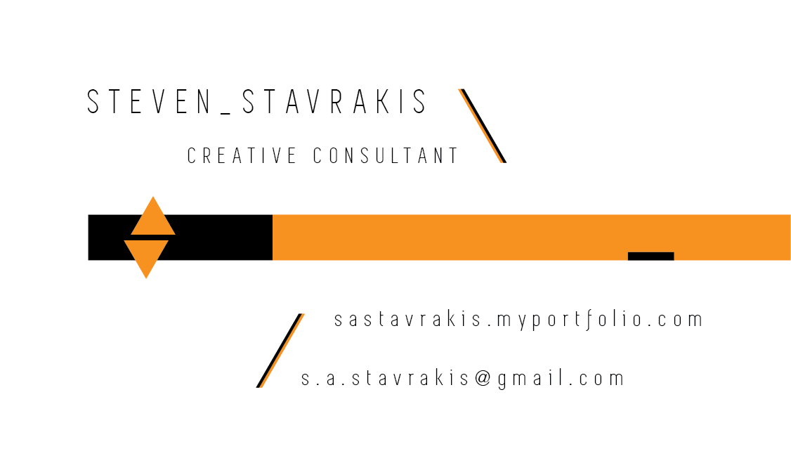
The back of the card went through two iterations, but the first idea was scrapped so quickly I didn't have the chance to save it. The back incorporates the same design as the front, everything in the same place, but includes the slanted lines above and below the vertical median. Looking at this in print made it obvious that the orange was detracting wholly from the simplicity I had aimed to create, and instead it was getting in the way of the design. If I were to remove all orange from this right now, I think the design would improve greatly.
The printed front. Here you can tell how vacuous the white is on the left side, and the logo is unable to balance it. I believe that I will need to restart the front from square one, opting for less emphasis on the logo, and more emphasis on the text.
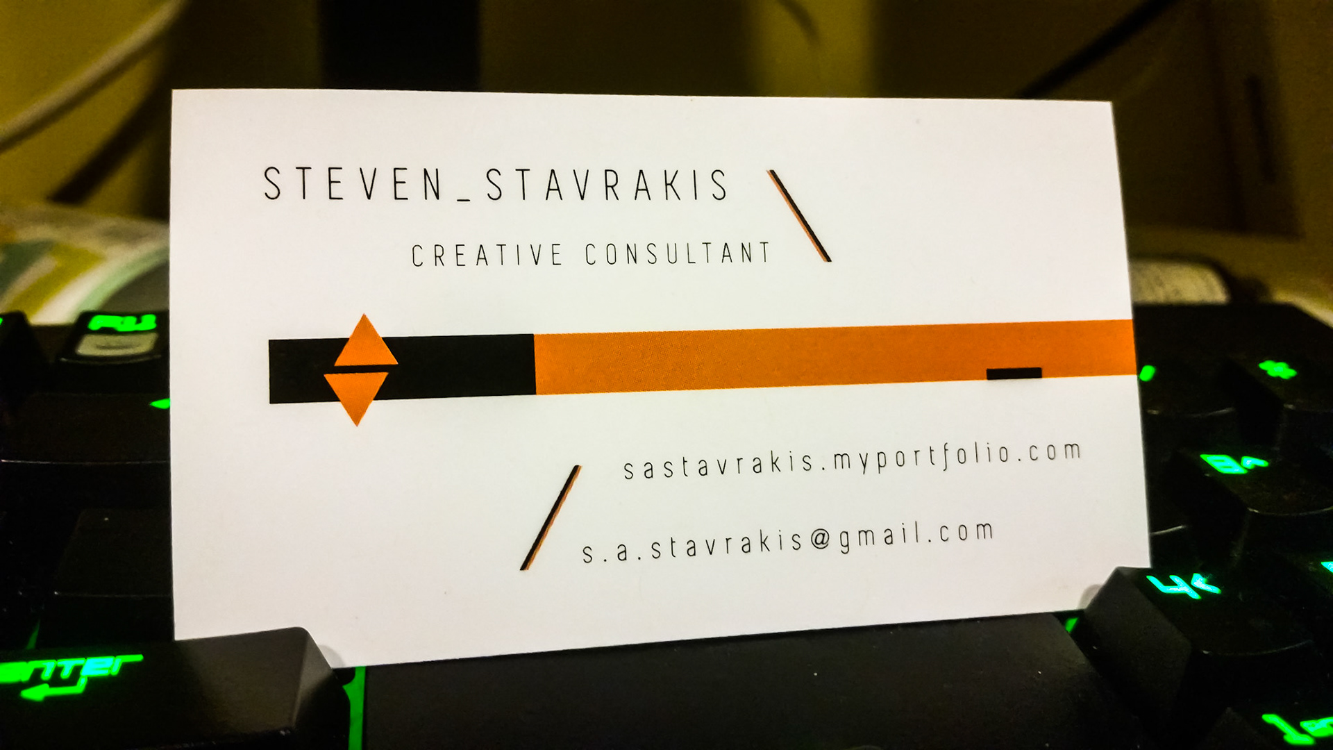
The printed back. Here you can see the deterioration in quality stemming from the poor print job. The angled lines are jagged and unbearable, the underscore on the right side overlaps the bounds of the orange, and the sides of the triangles are spotted with white. Again, the removal of all orange here would make it exponentially better in my eyes, making the current logo a cutout of the black bar behind it. These adjustments will be made in the coming weeks.
All in all, I am happy with the end product in the sense that I made it thus far. Furthermore, knowing that I am displeased with the design as is, but have modifications in mind for the future, gives me hope that I can salvage the design instead of starting on square one for the entire card. Feedback welcome and appreciated.